Park Avenue: when colour takes center stage
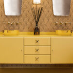
Colour has always been at the heart of the Park Avenue identity. Inspired by the distinctive elegance of 1920s and 1930s New York, the brand reinterprets the iconic language of the Art Deco era, revisiting its recognizable shapes, decorative details and unmistakable chromatic richness. In the Park Avenue collection, colour is not simply an aesthetic choice but a defining element of the design narrative. The bold, high-contrast palette evokes the vibrant energy and refined hedonism of the Roaring Twenties, transforming surfaces and furnishings into expressive elements capable of shaping the atmosphere of an entire space.
Iconic colours, reimagined
In the Park Avenue vision, colour does more than complement interiors, it builds them. Each shade is carefully selected to create a sophisticated visual scenography that reflects the glamour and elegance of Art Deco design. The result is a layered palette where strong contrasts meet luminous finishes and tones inspired by precious gemstones, creating spaces that feel both dramatic and harmonious.
The brilliance of metallic accents
Gold, bronze and brass play a key role in defining the collection’s aesthetic. Long associated with glamour and prosperity, these metallic finishes enrich interiors with warmth and character. Applied to furniture, detailing and lighting elements, they introduce geometric highlights that enhance surfaces with brilliance and a refined, jewel-like allure.
The depth of black
Among the defining colours of the Art Deco palette, black stands out for its depth and magnetic presence. Modern yet timeless, it introduces an element of mystery and elegance. When paired with lighter tones, black creates the strong visual contrasts that are emblematic of the Art Deco aesthetic.
The allure of jewel tones
Rich, saturated hues such as emerald green, bottle green, sapphire blue, midnight blue, ruby red and burgundy bring a sense of luxury and intensity to interiors. Inspired by precious gemstones and opulent materials, these colours add depth and atmosphere, enhancing the visual richness of any setting.
Balancing with light and pastel hues
To balance these dramatic tones, the Park Avenue palette also includes softer shades such as warm white, ivory, cream, powder pink and delicate blue. These lighter hues temper stronger contrasts and maintain an atmosphere that feels luminous, refined and timeless. Through this sophisticated interplay of colours, Park Avenue continues to reinterpret the spirit of Art Deco, transforming interiors into spaces where elegance, contrast and chromatic harmony take center stage.